


Mindful Medicine
Project Type
Healthcare Portal
Client
CareerFoundry
Timeline
June ‘21 -Jan ‘22
Platform
iOS
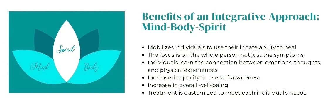
When mind, body, and spirit are examined as a whole, people are able to find and heal root causes to their health issues instead of treating individual symptoms.
Project Summary
My experience as a social worker lead me to explore mobile health apps and how they were incorporating holistic wellness.
Mindful Medicine will be a secure one-stop shop for users to manage their healthcare needs.
The app will be created with a holistic approach to wellness and an emphasis to learn more about mind and body connections.
-
As a Licensed Clinical Social Worker I’ve seen firsthand the value of connecting people with effective tools that support and empower them to become active members in their healthcare journeys.
Through my various roles, I worked with people who experienced complex physical and mental health issues that could be traced back to many interwoven factors including trauma, genetics, environmental factors, barriers to care, etc.
While interviewing and assessing these individuals, it was imperative to gather information from a holistic wellness lens in order to paint a comprehensive picture of their overall biopsychosocial health to develop effective treatment plans .
-
Recently I started to research current healthcare apps and noticed some interesting trends.
Currently, health apps are often separated into medical apps, mental health apps, or fitness apps.
Its rare to have a one-stop shop approach that combines all aspects of healthcare into one app or portal.
Beyond that, I discovered that while many healthcare portals exist today, few on the market aim to use advanced technology to better help users’ understand how their mind and body connections affect their health.
-
Mindful Medicine is here to change that.
Mindful Medicine is an accessible healthcare portal with an emphasis on holistic wellness that allows users to track and manage aspects of their physical, mental, and spiritual needs all in one secure space.
Users are also connected to educational resources, healthcare providers, and useful tools to discover connections and patterns between their physical and mental health.
When people feel like they understand and are in control of their bodies and minds, they are more likely to stay engaged with medical treatment, advocate for their needs, and ultimately transform their lives one step at a time.
The 5 W’s
-

Why
Users want an accessible one-stop spot to access health and wellness resources alongside their own health and medical information
-

Who
Health-conscious individuals with access to the health and wellbeing portal
-

When
Users visit the portal whenever they want to access its health and well-being features or to update their medical records.
-

Where
Users can access the web app on any device that has a connection to the internet
-

What
An inclusively designed responsive web portal (app) that provides health and wellness information, as well as a way for users to store health and medical information and appointments
My Role
UX/UI Designer
Discovery
Research
Competitive Analysis
User Stories
User Personas
User Journey
User Flow
User Interviews
Usability Testing
Affinity Mapping
Card Sorting
A/B & Preference Testing
Lo/Mid/High Fidelity Wireframes
Prototyping
My Process
I use the Double Diamond Design Process while researching and designing.

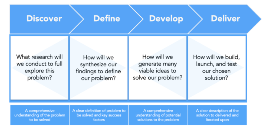
Problem Space
Users need a one stop-shop healthcare portal to effectively learn about and manage their holistic wellness needs.
Most healthcare apps do not offer advanced technology that highlights patterns and educates users on their own mind and body connections.
A high percentage of users’ do not trust healthcare apps to safely and securely keep their medical information private.
The Context
-
This was a project during my UX Immersion Course at CareerFoundry.
-
During the course I had to receive task approval from my CareerFoundry tutor and portfolio approval from my CareerFoundry mentor.
I was able to discuss questions and receive feedback with CareerFoundry leaders and peers via Slack.
-
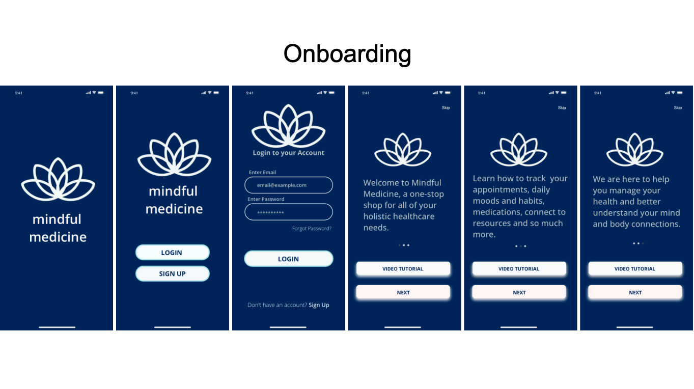
An onboarding page (a screen or screens that show(s) the user the basics of getting started)
A way to sign up and log in that lets users input and save their personal information
A home screen or dashboard where users can access their information
A menu that allows users to navigate the application
A feature that allows users to store and log their medical and health information
(e.g., appointments, medication/supplements, diagnoses, daily activity trackers, journal options, mood trackers. etc.)
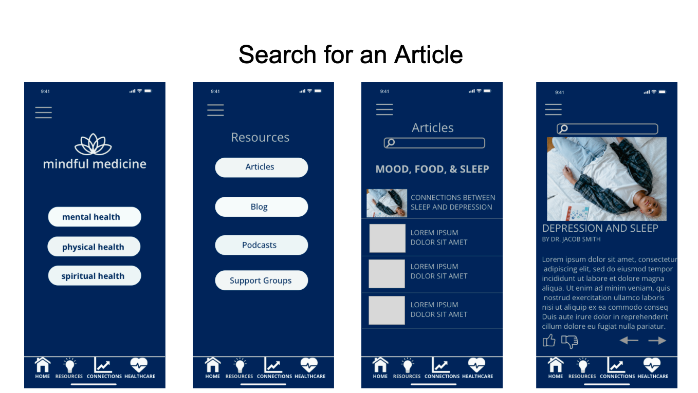
An education and training feature that supports the users in learning more about
health and wellness (variety of options and comprehension levels: articles, videos, podcasts, games)
A feature that allows users to see patterns between their physical and mental health (graphs/charts)
Security features to ensure users’ PHI (persona health information) is HIPAA compliant and safe in portal
Goals
To help people efficiently and effectively manage their healthcare in one place.
To educate people on their mind and body connections which will help them better understand their own health needs.
When people are better engaged in their healthcare they ultimately stay out of the ER/hospital more which can save money.
The Research
I conducted a mix of quantitative and qualitative research to highlight users’ needs within a healthcare portal and to ensure optimal app design.
Target Audience
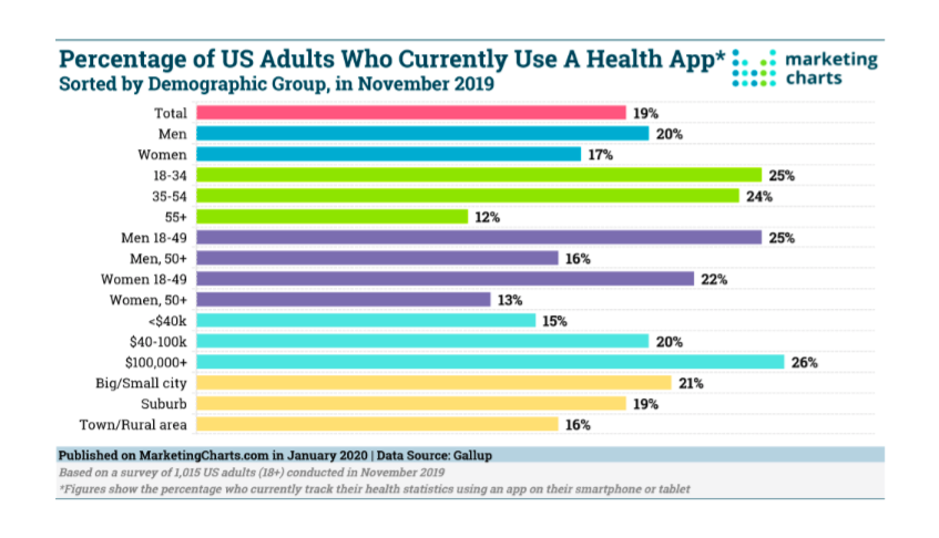
The target age group will be 25-40 as millennials prove to be the highest percentage of adults who use healthcare apps.
Also most people are not able to make medical decisions for themselves until they are 18 years old.
Parents or caregivers will be able to use the app for minors or any adult in their care with consent.
Population Metrics
I chose millennials as the the key target demographic because they currently represent one of the largest age groups using mobile heath apps.
43% of millennials prefer to access patient portals from their smartphone.
1 in 5 (20%) Americans have tried or are using both fitness trackers and apps.
87 million people in the US used a health or fitness app monthly in 2020.
Interest in mental health apps is linked to increasing mobile phone access, with over 225 million people in the United States and over 2 billion people around the globe using these devices today.
Dollar Value Metrics
The mHealth apps market is valued at $47.7 billion in 2021 and projected to grow to $149 billion by 2028.
The biggest cost saving benefit from mHealth apps will be in reducing hospital costs by decreasing readmission rates and length of stay, and by assisting with patient compliance to medication plans.

What Does This Mean?
Mobile Health Apps are projected to be a booming business in the years to come.
Not only do mobile health apps create revenue and cut costs but more importantly they save lives.
An Increase in patient compliance leads to healthier people. Healthier people live longer.
Sources
https://www.marketingcharts.com/industries/pharma-and-healthcare-111492
Constraints and Challenges
Business
It is still a niche market to have a comprehensive healthcare portal combine all aspects of health/wellness while highlighting connections between physical and mental health in one secure space. Because of this it may be risky to branch out into an underdeveloped market, where users may not be ready for this type of tech.
Economical
One of the biggest constraints in today’s mobile health market is users’ lack of trust regarding their privacy, especially when it comes to medical information. Please see privacy metrics below.
Social
People with severe medical or mental health issues may have barriers to using app such as lack of motivation, memory issues, functioning issues. People can be hesitant to use medical apps due to privacy/security fears.
Technological
Because I worked solely on this project I still need to connect with experienced developers and data scientists that can make Mindful Medicine’s vision a reality.
Privacy Metrics
Millions of people every year avoid treatment because they know health data is not private.
One of the biggest deterrents from people using mobile health apps is privacy concerns.

“Approximately 50% of surveyed organizations said security and privacy concerns were a leading factor in why consumer adoption of mobile and digital health tools is not more widespread.”
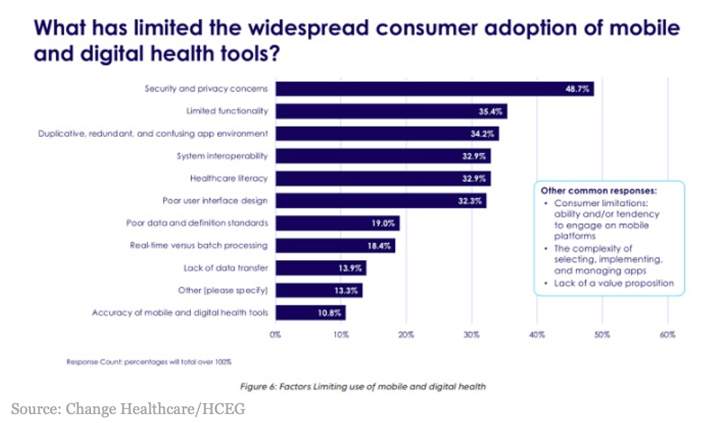
What Does This Mean?
Transparency is a must.
In order to establish trust with users, Mindful Medicine will always be transparent with how privacy data is shared and stored.
Competitive Analysis
-
OVERVIEW:
I will be analyzing a potential competitor called Bearable which is a mood and symptom tracker app that allows users to store, track, and manage both their physical and mental health needs “all in one place”.
KEY OBJECTIVES:
Bearable presents itself as a customizable, one-stop shop health tracker that helps users find connections/patterns between their physical and mental health. To stand out from competitors, they emphasize the app’s advantage of storing all your healthcare needs in one space with headers such as “All Health Tracking in One App” and “No More Need to Juggle Multiple Apps.
BOTTOM LINE
Easy to use and customisable for users’ needs
Focuses on finding correlations between physical and mental health issues
Secure and Encrypted, never will sell data
OVERALL STRATEGY
There are definite opportunities for growth with Bearable’s Marketing and PR approach. Social Media numbers are low (Twitter and Instagram both under 500) and articles on Google are basically non-existent except for some favorable reviews and the site’s own blog articles. The founder updates the blog weekly and the app has a solid review on the Google Play app store (4.7/5 out of 2,602 reviews). It’s not clear what their overall marketing strategy entails.
BOTTOM LINE:
Small online presence
High reviews overall
PR approach leaves a lot to be desired
MARKET ADVANTAGE:
Bearable is an innovative and unique app highlighting links between mental health and physical health. Few apps on the market focus on tracking both mental and physical health. The market is saturated with apps focusing on mindfulness, meditation,mental health and countless others related to improving physical health, but it is rare for an app to incorporate a holistic approach to tracking and measuring mind/body connections.
BOTTOM LINE:
Innovative platform
Simplifies users’ needs into one app
MARKETING PROFILE
Forefront on the app website are rave reviews from Psych Central and Cedars Sinai including “Best Overall Symptom Tracker” and “Best App for Tracking Patient Reported Outcomes”. Google Plays online description of the app asks, “Tired of juggling multiple apps to keep track of your mood, symptoms, sleep, exercise, diet, and medication? We think all of this should be kept in one convenient place so that you and your health professional can get the full picture.” Bearable was launched in 2020 by founder James Saady after chronic illness forced him to leave his full time job. The app was built after his personable experience tracking his mood, symptoms, and daily activities to give his providers a clearer picture for possible diagnosis. Per James, the app was built using research and data gathered from the online chronic condition community. His goal was to create an app where users could easily track/store all of their health information in one place while highlighting mind/body connections. He wanted it to be as secure, accessible, customisable and affordable as possible. James was able to create this app through extensive evidence based testing and research. As of 3/2021 James shared that Bearable has reached over 100,000 users with plans for continued improvements, growth, and evolution.
BOTTOM LINE:
Rave reviews from reputable/clinical sources
Mission based in service rather than profit
Continued growth and data driven goals for future
-
UX ANALYSIS
Usability
Bearable’s UI looks sophisticated and pleasant, with an adorable Bear logo throughout. Some of the screens seem overloaded with information which could appear overwhelming to new users. Also some basic UI flaw’s stuck out. The icon (3 vertical lines usually at top left or right of screen) typically used as a general ‘Menu’ button did not lead to a general menu. Instead it lead to some type of calendar/symptom tracker with an unclear function or explanation. The information that would usually be stored in the typical ‘Menu’ icon, is located in the bottom toolbar under the ‘More’ button. This is counterintuitive and confusing.
Layout
The individual pages of the app are fairly intuitive and easy to navigate. The Insights page is a bit overwhelming because of the amount of graphs and visual information presented. Also the name ’Insights’ does not make it clear that this is where you’ll be able to see patterns and links between physical/mental health. They do offer explanations and instructions on the question mark icon located on top left corner which helps users to understand form and function of this page. However, if someone is dealing with physical and/or mental health issues and already not feeling well with decreased motivation, the overload of information could be a continued barrier or motivational deterrent.
Navigation Structure
Again the ‘Menu’ and ‘More’ icon seem to be reversed to what is typically placed under each item. That being said the rest of the navigation on the app is fairly straightforward and easy to use. Some of the pages are overloaded with information making it a bit congested which could lead to navigation issues because users may become overwhelmed or confused with the amount of information on each page.
Compatibility
Bearable currently supports iOS and Android.
Differentiation
Overall, Bearable is a one of a kind app that offers users a space to record and track all of their moods, symptoms, and daily activities all in one place. This can be helpful especially for people dealing with confusing chronic illnesses. The app was created with these users in mind, focusing on accessibility, customization, and simplicity. While the app does many things right, a few necessary UI edits and stronger marketing strategies could make this app reach a wider user base. Many reputable, clinical settings have already utilized and shared excellent reviews proving this app can be extremely helpful when implemented correctly.
There is a way to export app information on Bearble to providers, but it does not seem to be a main feature. I would love to expand on this idea and create a healthcare portal where providers and patients can share and access this health information. They could take note of the mind/body connections and have productive chat/video conversations within the app.
Calls to Action
Bearable has a free version and a premium version. However, I signed up for the premium version not knowing I could continue on the free version. After onboarding I was met with a paywall, so I signed up for premium not knowing the free version was still an option.
-
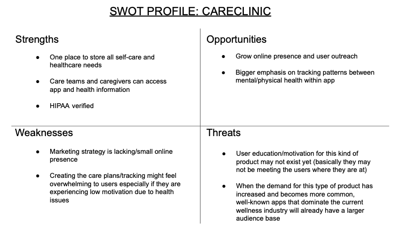
OVERVIEW
I will be analyzing a potential competitor called CareClinic which is a health management platform. Per the Google Play description, “CareClinic is your daily all-in-one Health & Wellness App that helps you measure, learn, and improve your health.”
KEY OBJECTIVES
CareClinic markets itself as an “All-In-One Self-Care App” and “preventative and proactive care management for you and your caregivers”. They often promote the fact that a user is able to track all of their healthcare needs in one app. According to the Apple Store Preview users are able to track “ mental health, medications, mood, pain, symptoms, chronic illness, sleep, fitness & health diary” to take control of your healthcare and understand your behavior/habits. Users are also able to add their care teams/caregivers as needed to monitor progress.
BOTTOM LINE
Healthcare Tracking all-in-one place
Preventive and proactive care management
Users able to add care teams.
OVERALL STRATEGY
Browsing the CareClinic website, it’s obvious that they do have favorable reviews from a few big affiliate sources including Livestrong, University of Arizona, and Critical Care Recovery. App reviews are solid with 4.8/5 on GooglePlay (628 reviews) and 4.8/5 in app store (2k reviews) albeit small. Like many other smaller apps, the website has a Blog with topics ranging from physical illnesses to mindfulness to mental health issues. Social media is lacking with limited user range, and again I was not able to find any feature articles or podcast episodes related to the app. It looks like the founder attempted a podcast in 2019 but that only lasted 2 episodes. Again, it is unclear what the overall marketing strategy is at it seems to be lacking.
BOTTOM LINE
Small online presence
High reviews overall
PR approach leaves a lot to be desired
MARKET ADVANTAGE
The all-in-one feature is a plus, because again many healthcare apps these days keep tracking mental health and physical health symptoms separate. CareClinic integrates the two which make sense because research has proven over and over again that our mental and physical health are inextricably linked. CareClinic has a HIPAA Seal of Compliance verification on their website which is huge because it shows that they meet medical privacy standards meaning users can feel confidant knowing their private medical information is secure. It’s also a huge advantage that users are able to share their care plans and health information with care teams directly from within the app.
BOTTOM LINE
HIPAA verified
Care teams are able to access info
MARKETING PROFILE
Per CareClinic’s website the app was, “built by founder and CEO, Akshay Khanna. A health and fitness enthusiast who believed that having all data for mental and physical health in one place was the key to improving outcomes. There wasn’t an app that took a scientific approach to helping users determine what was working and what wasn’t so he built it in 2018.” The website also explains that the app was built with users in mind (over 500 iterations and continues to improve), while still trying to maintain clinical integrity without the “clinical environment.” While anyone can use and benefit form the app, users with chronic health conditions, mental health issues and/or health goals seem to be a target audience. The website blog is actually very useful because it shares an article topic and then towards the end of the article it explains how this topic relates to the app. It then breaks down what features and functions of CareClinic are specifically related and useful for the topic at hand. Social media accounts are active and up-to-date with an emphasis on mental health postings, although follower numbers are on the smaller side, the app website reports they have over 250,000 app engagements monthly. Most of the ‘Press’ articles shared on website are from 2020.
BOTTOM LINE
Built with users in mind
Blog is useful and educational
Marketing outreach/growth needs more focus

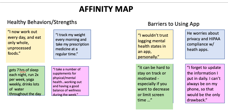
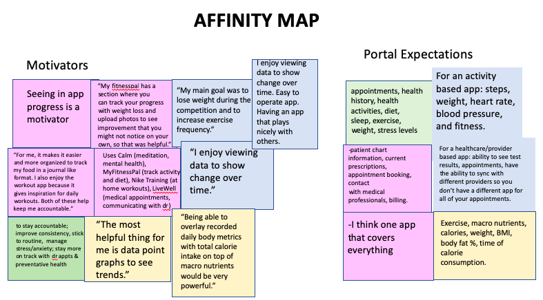
User Interviews
-
Understand what users are looking for in a health and wellness portal.
Learn about issues users have experienced in the past when using health and wellness apps.
Discover what aspects users enjoy in their current health and wellness apps.
-
Interviewed 3 participants within the target age group who have used health and wellness apps before
-
1. Tell me a bit about yourself. What do you do for work and fun?
2. What are some of your interests and daily routines?
3. What does holistic wellness mean to you?
4. Do you have any health or wellness routines already established in your day to day life?
5. Do you currently use any health or wellness apps to manage or improve your physical or mental health needs? Which ones?
6. Why have you chosen to use health and wellness portals/apps now or in the past? What were the goals you were hoping to achieve?
7. What do you find helpful when trying to manage your physical and mental health needs online?
8. Why do you think managing your health and wellness needs online can be difficult at times?
9. Have you recently used health and wellness apps? Can you share with me what your experience with this has been like? What were things that frustrated you and things that motivated you to keep going?
10. What elements would you add to your online health/wellness experiences to make them more beneficial?
11. What are activities you would expect to be able to track/manage in a healthcare portal.
12. What features do you think makes a health/wellness app feel inclusive and accessible to users?
13. How would discovering and tracking patterns between your physical and mental health be helpful to you?
-
Creating user app interaction from a strengths based approach will increase confidence/motivation and decrease shame/resistance.
Gaining users’ trust (specifically with their PHI) is vital to their motivation and comfort when using the app. This is a non-negotiable standard we will always meet.
Having to input health info regularly can decrease user motivation. This app will attempt to minimize user effort and screen time.
Nowadays users typically have multiple apps to manage their health/wellness needs. We will aim to be a one stop shop so users can focus on one app and save time.
Because simple and easy to use features are vital staples of an inclusive/accessible app, we will put this at the forefront of our design process.

Based off of the research, I was able to create user personas, stories, journeys, and task flows that represented real life user needs, wants, and concerns with a mobile health app.
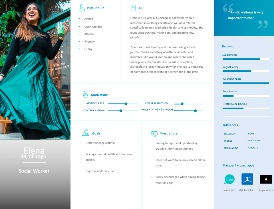
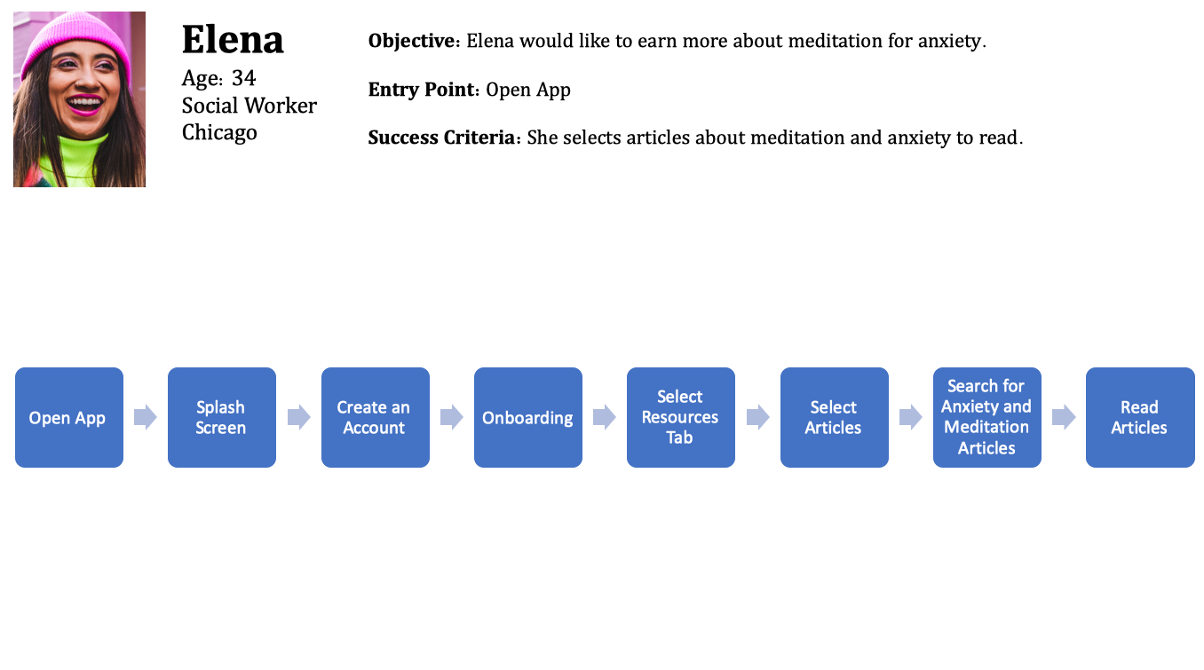
User Persona
Meet Elena!
She’s using Mindful Medicine to learn more about her mind and body connections related to her mental health and insomnia. She’s also interested in developing a meditation practice.
User Stories
-
Access to Providers
As a user I want quick and easy access to providers including credentials, insurance, and scheduling.
-
Sign Up and Login
As a user, I want to sign up and login, so that I have a personal account that I can open at any time to access my stored healthcare information.
-
Home Screen
As a user, I want an accessible and simple home screen, so that I can easily find and navigate app features.
-
Menu
As a user, I want intuitive navigation, so that I can access different screens and features on one place.
-
Education and Training Features
As a user, I want educational resources for holistic wellness, so that I can learn how to better manage my health in an integrative approach.
-
Physical and Mental Health Patterns
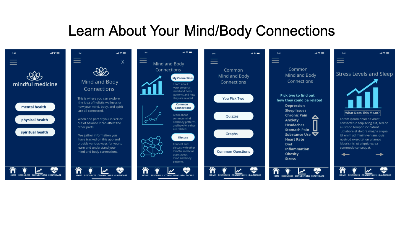
As a user, I want a feature that highlights physical and mental health patterns, so that I can become more aware of how my mind and body are connected.
-
Store and Log Health Information
As a user I want a way to log and store my health information, so that I can track my healthcare activities and needs.
-
Security Features
As a user, I want my personal health information (PHI) to be secure, so that I can feel safe knowing my medical information is private.
User Journey

Low- Fidelity Wireframes
Based off of the research I sketched low-fidelity wireframes.
These wireframes featured three buttons on the Home Page including a Mind, Body, and Spirit Tab.
These are my version 1 sketches.


Card Sorting
I conducted a Card Sorting exercise to understand how users were interpreting certain categories within the app. This is what I found.

Originally the Home Page was going to feature Mind, Body, Spirit buttons. The card sorting was helpful as it showed that users had many different ideas of what Mind, Body, Spirit buttons meant and what each would contain.
Users placed several of the same topics under different categories, showing that much of this design is not as intuitive as initially thought. As a revision we will rename the category tabs as Mental Health, Physical Health, Spiritual Health as this should more clearly describe what each tab would contain.
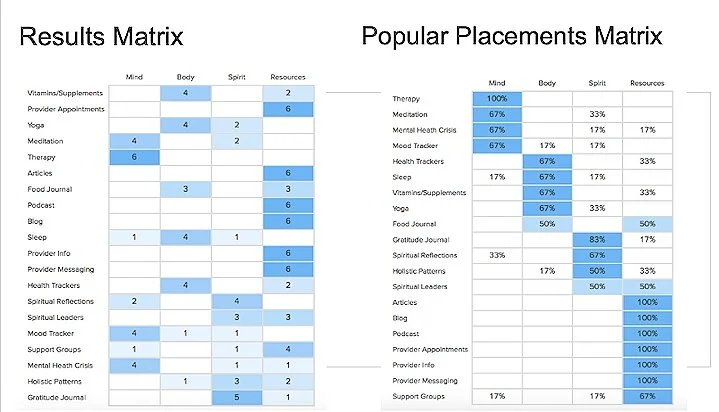
In addition, there were unanimous results for much of the Resources tab. Initially the idea was for topics related to health providers to be placed within the Body tab.
The card sorting showed users unanimously sorting Provider categories under the Resources tab (given the 4 categories). Because of this, we will need to rethink and move the placement of Provider related tabs.
Mid-Fidelity Wireframes Version 1
These are my version 1 mid- fidelity wireframes.


Version 1 Prototype
After my first mid-fidelity wireframes, I made more detailed wireframes in Sketch and created this version 1 prototype which was used for usability testing.
Prototype Link: https://invis.io/Q6122PVNYVTE
A/B & Preference Testing
I conducted two preference tests to secure an app logo and Login/Sign In button. These were the results.
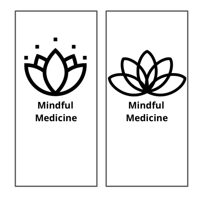
Test 1
30% of participants chose 1st version and 70% chose 2nd version
Screen 1 Feedback: different, unique, draws your eyes up more
Screen 2 Feedback: simple, prettier, peaceful, congruous with the idea of mindfulness
Conclusion: Screen 2 is more preferred with 70% of users choosing this screen as it leaves them with more positive feelings
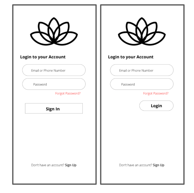
Test 2
50% of participants chose version 1 and 50% chose version 2.
Screen 1 Feedback: symmetry, more centered, looks slightly better centered
Screen 2 Feedback: more modern, rounded corners matches better
Conclusion: A combination of the two might be the best solution as the result were split down the middle

Revised Designs
The 1st screen was the clear winner with 70% of participants preferring this more peaceful and simple lotus icon.
The 2nd screen is a revised screen combining feedback from both screens as users were split 50/50. Edges of button were rounded as this felt more modern but the Sign In button was centered as users stated liking this.
Usability Testing
After creating my first prototype I was ready to conduct usability testing.
-
Introduction:
Mindful Medicine Moderated Remote Usability Test (Mobile)
Stakeholders: TBD
Last Updated: 10/23/2021
Background:
Mindful Medicine is a secure and intuitive health and wellness portal that allows users to manage most aspects of their healthcare in one convenient place. The app is designed for users with multiple health and wellness needs who aim to manage, understand, and transform their healthcare in a holistic approach.
Goals:
The goal of this study is to assess the learnability for new users interacting with the heath and wellness application for the first time on mobile. We would like to observe users’ understanding and comfort levels navigating the app and how to complete basic initial functions such as signing up, locating a needed resource, adding appointments, etc.
Test Objectives:
Observe users’ ease and comfort of the app while navigating basic functions.
Observe users’ understanding of completing specific tasks.
Methodology:
The study will be held remotely on Zoom at the participants’ chosen setting and will be conducted as a moderated remote test. The test will include a test overview, informed consent signing, mobile test with the Mindful Medicine app, and a debriefing.
Participants:
The study will test 5-10 participants who were recruited through researcher’s personal network to participate in the study. They were screened for basic demographic information and for their interest in managing and learning more about their health and wellness.
Schedule:
Usability test sessions will take place on (TBD) via Zoom. Sessions are scheduled between 5:00pm - 9:00pm.
Sessions:
Participants will individually participate in 10-15 minute usability test sessions on their mobile device.
Equipment:
Testing will be carried on the participants’ persona devices whether mobile or desktop. Testings and recordings will be done via Zoom.
Metrics:
Errors will be measured using Jakob Nielsen’s scale:
0 = I don't agree that this is a usability problem at all
1 = Cosmetic problem only: need not be fixed unless extra time is available on project
2 = Minor usability problem: fixing this should be given low priority
3 = Major usability problem: important to fix and should be given high priority
4 = Usability catastrophe: imperative to fix before product can be released
Test Script: TBD
Test Tasks: TBD
-
The study will test 5-10 participants who were recruited through researcher’s personal network to participate in the study. They were screened for basic demographic information and for their interest in managing and learning more about their health and wellness.
-
Introduction
Hi (participant’s name). My name is Laura Rountree. I am the Lead Designer for a new health and wellness app. I will be guiding you through the test.
Today we will be asking you to test out a new health and wellness app called Mindful Medicine. We hope these tests show us what works well on the app and what needs to be improved. Please remember there are no right or wrong answers. We ae testing the app not you. Any and all feedback is useful.
We will begin by asking you some general questions and then move on to completing specific tasks in the app. Throughout the test we ask you to “think out loud” and share your thoughts while completing each tasks. This will help us gain better insight into your feelings and thoughts while you are in the app. This is extremely helpful and will allow us to make the app better. The test will take a total of 15-20 minutes to complete.
Lastly, before we begin I need to ask your permission for the session to be video recorded. The recording will be used for research purposes only and will not be shared anywhere else.
If at any point you have any questions or concerns, please feel free to ask away. Also feel free to let us know if you need a break or need to end the session early. Do you have any questions or concerns at this time? No? Okay! Again thank you so much for your participation!
Demographics
Please select your age range:
• 24-34 years
• 35-45 years
• 45-55 years
• 55+
Where do you live?
What is your current occupation? Are you single or partnered?
Do you have children?
Background Questions:
Before we take start, I’ll ask you a few brief questions to help me better understand how you might use Mindful Medicine.
• Do you have any health/wellness apps you currently use regularly to manage your healthcare? Which ones?
• What are you favorite features on these apps? Why?
• What features do you wish were included in these apps that currently are not? Why?
Open-ended questions
Thanks for taking the time answer these questions! Now, I would like to show you the Mindful Medicine app and get your initial feelings and thoughts.
Take a moment to look over the home page. Before you click on anything, what is your first impression of the app? Does anything immediately stand out to you? What are some things you like or don’t like about the app? What do you think about the information shown on the screen? Please think out loud as much as you can!
Thank you for sharing your thoughts and impressions with me! I really appreciate it!
Now that you’ve looked at Mindful Medicine, can you tell me what the purpose of the app is? Thank you! Now, we’ll give you a few tasks to do using the app.
Tasks
Now we’ll give you three tasks. As you complete each task, please remember to think out loud and share with us how you’re thinking and feeling as you navigate through the app.
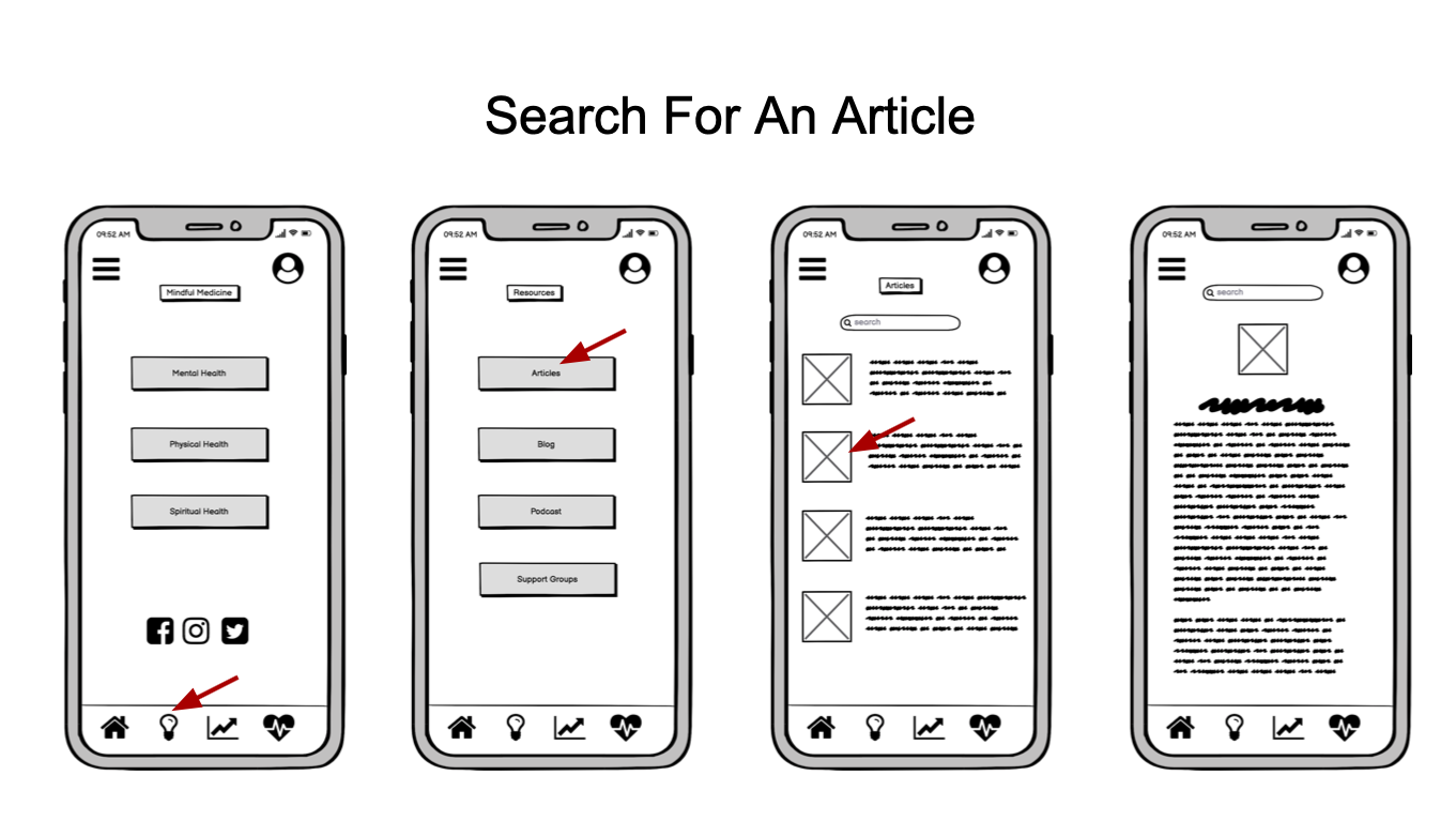
1. You have not been sleeping well and suspect it may be related to your recent diagnosis of depression. Using Mindful Medicine, please find an article about sleep habits and depression.
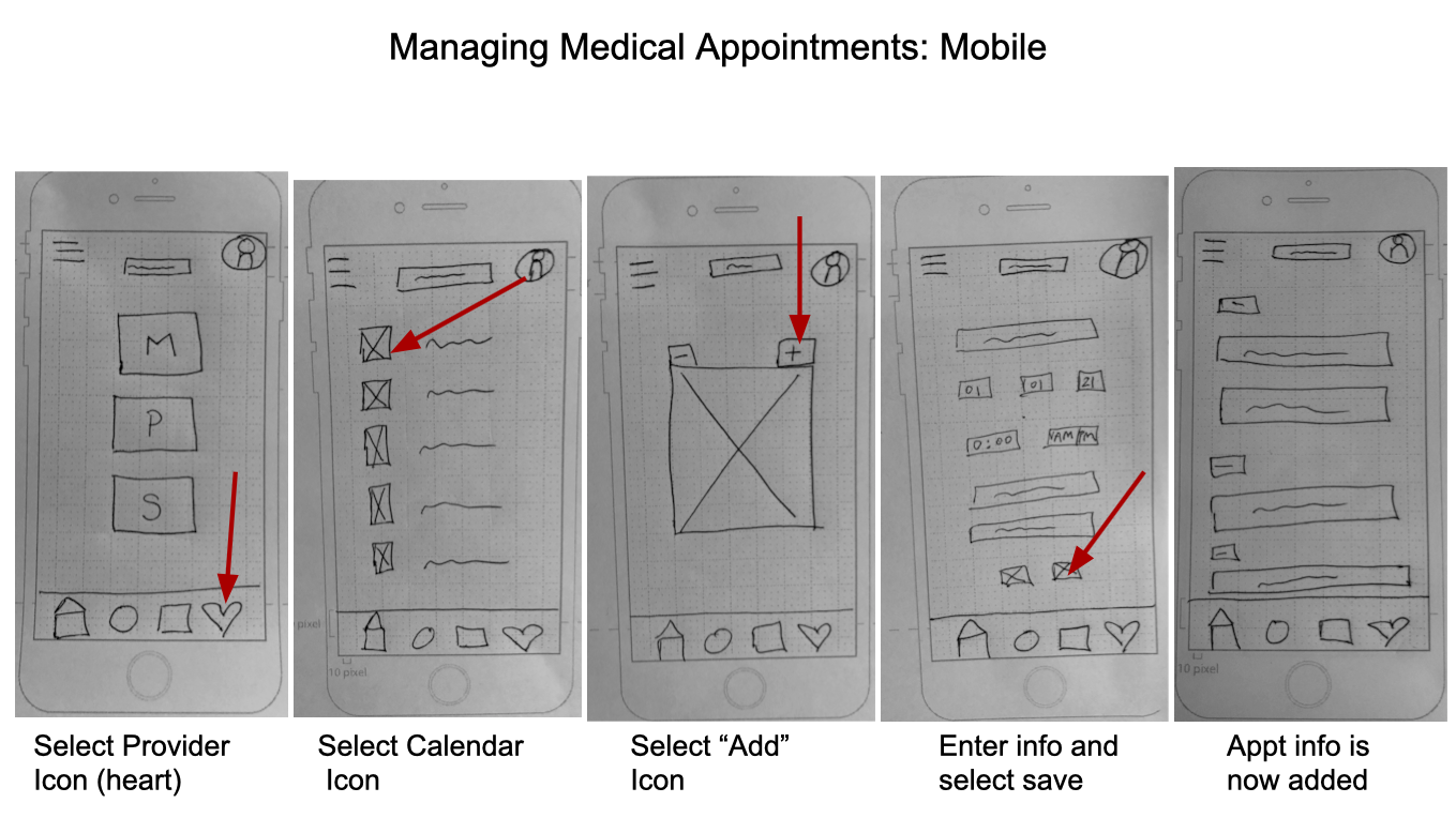
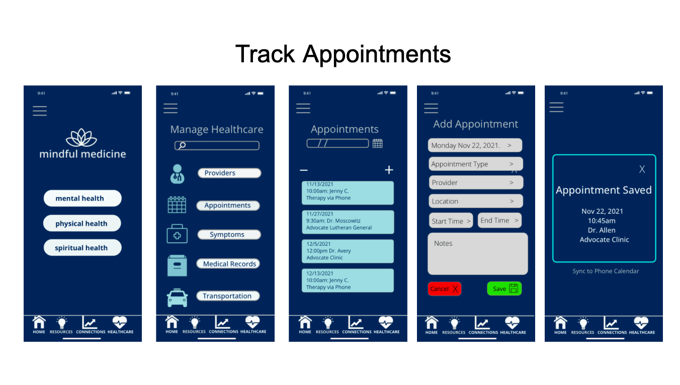
2. You scheduled your annual physical with your primary care physician. Use Mindful Medicine to add this appointment into your schedule.
3. You are interested in learning and talking to others about common mind and body connections that can affect your health. Use Mindful Medicine, to discuss common holistic connections with Mindful Medicine’s online community.
Wrap-Up
Okay! That’s the end of the session! Thanks for participating and helping me better understand how I can improve Mindful Medicine. Pease let me know if you have any further questions or comments. Thank you!
-
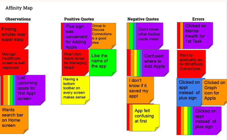
Most participants were confused by Icon symbols and meanings
Every participant had issues with Add Appointment task. These screens need to be reworked.
Almost every participant thought first click for first task would be Mental Health Tab not Resource Icon
Once users knew what the icons meant they explained app felt more intuitive and easy to use
Most participants understood and like idea of Mind/Body Connection feature but they were confused by icon and screen layout

Usability Test Report
-
Issue 1
Users were confused where to add Appointments. (High)
Suggested Change: Add plus sign to first appointment screen.
Evidence: 6/6 users agreed the plus sign should be on the first appointment screen.
-
Issue 2
Upcoming appointments should be listed on first appointment screen. (High)
Suggested Change: Instead of calendar to choose date on appointment screen, list upcoming appointments so its the first thing users see.
Evidence: 6/6 users agreed the appointments should be listed on the fruit appointment screen.
-
Issue 3
The app felt confusing at first. (Medium)
Suggested Change: Onboarding will explain app features, but redesign of icons and tabs may alleviate confusion as well.
Evidence: 3/6 users said app felt confusing at first.
-
Issue 4
Toolbar icons were confusing. (Medium)
Suggested Change: Additional research could help with this as well as using more familiar toolbar icons or labels for icons.
Evidence: 4/6 users said toolbar felt confusing.
-
Issue 5
User was unclear if her appointment saved. (Low)
Suggested Change: Add a screen that shows appointment saved.
Evidence: One user said she was unclear if her appointment saved, but as the designer, I felt that this was an important addition as this is a common feature offered on most apps.
High-Fidelity Wireframes Version 1
After receiving the results from the usability testing, I was able to make the needed changes including:
revising the first appointment screen with a plus sign to add appointments
revising the appointment screen with a list of upcoming appointments first instead of calendar
adding identifying labels to toolbar icons so they are more easily decipherable
Adding an appointment saved screen hat can also link to phone calendar
#/media/File:Double_diamond.png)
After peer collaboration and feedback from my CareerFoundry tutor and mentor, I continued to revise the high-fidelity wireframes until I designed the current prototype.
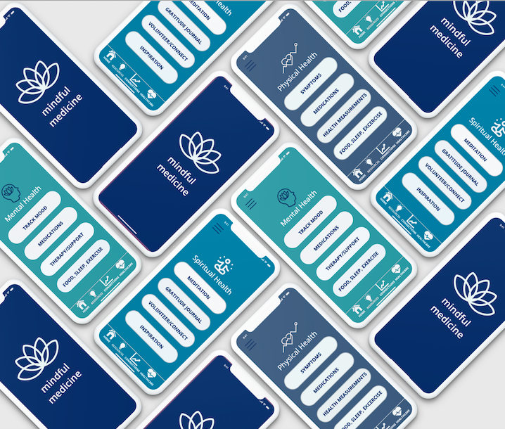
The Solution
Mindful Medicine High Fidelity Wireframes Version 2
Prototype Link
What’s Next?
Currently I am working on overall functioning issues. Eventually I will be able to apply testing to targeted users with specific needs/medical backgrounds. This will help me ensure that the app is accessible to people with varying complex physical or mental health issues.
The UI needs improvement and continued upgrades, including the Mind/Body Connection Feature. Onboarding could use continued improvement as well. Specifically, with more pop-up onboarding for things like the toolbar directions.
I believe that adding some type of community engagement/social connection feature for users to feel like they are part of a mindful medicine community will result in an increase of user app engagement by 30%.